Shopify Theme 2.0 Input Settings Tutorials
In Shopify Theme 2.0, the input object is used to define customizable settings in the Theme Editor. Each input type has specific properties that allow merchants to configure their theme without modifying the code.
Shopify Theme 2.0 Input Types
| Input Type | Description | Example Use Case | Key Properties |
|---|---|---|---|
| Toggle switch (true/false) | Show/hide banner, enable feature |
|
| Numeric input field | Items per row, max products |
|
| Radio button selection | Layout style, display options |
|
| Numeric slider | Padding, font size |
|
| Dropdown menu | Font style, layout type |
|
| Single-line text input | Store name, heading text |
|
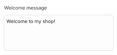
| Multi-line text input | Store description, long text fields |
|
Specialized input setting types | |||
| URL input field | Button link, social media link |
|
| Color picker | Background color, button color |
|
| Allows merchants to select a background color | Section background color |
|
| Lets merchants select a predefined color scheme | Theme color presets |
|
| Defines a group of colors used together in a section | Customizing multiple color elements | |
| Allows merchants to select a specific blog article | Featured blog post section | |
| Allows merchants to select a blog from their store | Display latest blog posts | |
| Allows merchants to select a single collection | Featured collection section | |
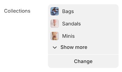
| Allows merchants to select multiple collections | Displaying multiple collections |
|
| Allows users to select a font. | Choosing a custom font for headings/body text. |
|
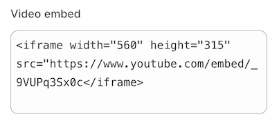
| Provides a field for custom HTML | Custom embedded code, tracking scripts |
|
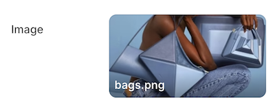
| Allows users to select an image. | Hero banner, product feature images. | |
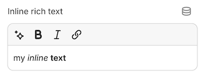
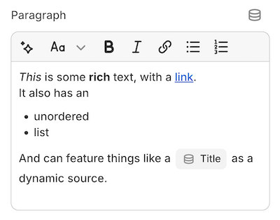
| A simple rich text input allowing basic formatting | Short descriptions, subtitles |
|
| Allows merchants to select a navigation menu | Footer links, sidebar navigation | |
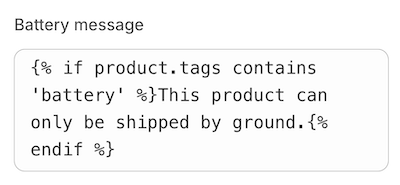
| Allows merchants to add custom Liquid code | Custom dynamic content | |
| Allows merchants to select a specific page | About Us, FAQ page selection | |
| Allows merchants to select a single product | Featured product display | |
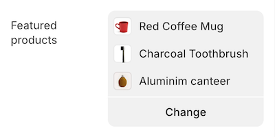
| Allows merchants to select multiple products | Showcasing a product collection |
|
| Allows formatted text input. | Blog excerpts, footer text. |
|
| Provides text alignment options (left, center, right) | Adjusting heading and text alignment |
|
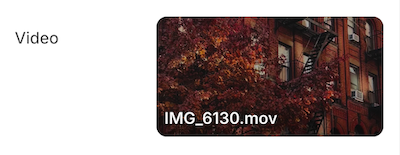
| Allows merchants to upload or embed a video | Hero section video, product demos |
|
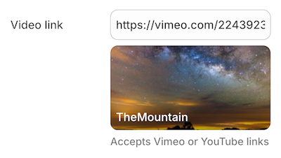
| Accepts YouTube/Vimeo video URLs. | Embedding a promotional video. |
|
| Non-interactive title for grouping settings | Theme settings sections |
|
| Informational text block | Descriptive text in settings |
|
| Allows merchants to select a single metaobject entry | Displaying structured data |
|
| Allows merchants to select multiple metaobject entries | Listing structured data sets |
|
Shopify Theme 2.0 Input Standard Attributes
| Attribute | Description | Required |
|---|---|---|
| The setting type, which can be any of the basic or specialized input setting types. | Yes |
| The setting ID, which is used to access the setting value. | Yes |
| The setting label, which will show in the theme editor. | Yes |
| The default value for the setting. | No |
| An option for informational text about the setting. | No |
Shopify Theme 2.0 Input Schema and Output
| Name | JSON Schema | Output |
|---|---|---|
| If default is unspecified, then the value is |  |
| |  |
| |  |
| |  |
| Segmented Select When Show
Dropdown Select When Show
| Segmented Select 
Dropdown Select  |
| |  |
| |  |
| |  |
| |  |
| |  |
| |  Collection List Details 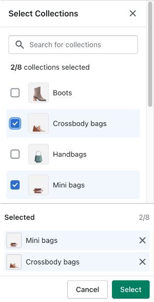 |
| |  |
| |  |
| |  |
| |  |
| |  |
| |  |
| |  |
| |  |
| |  |
| |  |
| |  |
| |  |
| |  |
| |  |
| |  |
| |  |
| |  |
Color Scheme Group
A setting of type color_scheme_group outputs a color scheme which is composed of the following input setting types:
-
header
-
color
-
color_background
Color schemes can be added only in settings_schema.json.
Schema
{
  "type": "color_scheme_group",
  "id": "color_schemes",
  "definition": [
    {
      "type": "color",
      "id": "background",
      "label": "t:settings_schema.colors.settings.background.label",
      "default": "#FFFFFF"
    },
    {
      "type": "color_background",
      "id": "background_gradient",
      "label": "t:settings_schema.colors.settings.background_gradient.label",
      "info": "t:settings_schema.colors.settings.background_gradient.info"
    },
    {
      "type": "color",
      "id": "text",
      "label": "t:settings_schema.colors.settings.text.label",
      "default": "#121212"
    },
    {
      "type": "color",
      "id": "button",
      "label": "t:settings_schema.colors.settings.button_background.label",
      "default": "#121212"
    },
    {
      "type": "color",
      "id": "button_label",
      "label": "t:settings_schema.colors.settings.button_label.label",
      "default": "#FFFFFF"
    },
    {
      "type": "color",
      "id": "secondary_button_label",
      "label": "t:settings_schema.colors.settings.secondary_button_label.label",
      "default": "#121212"
    },
    {
      "type": "color",
      "id": "shadow",
      "label": "t:settings_schema.colors.settings.shadow.label",
      "default": "#121212"
    }
  ],
  "role": {
    "text": "text",
    "background": {
      "solid": "background",
      "gradient": "background_gradient"
    },
    "links": "secondary_button_label",
    "icons": "text",
    "primary_button": "button",
    "on_primary_button": "button_label",
    "primary_button_border": "button",
    "secondary_button": "background",
    "on_secondary_button": "secondary_button_label",
    "secondary_button_border": "secondary_button_label"
  }
}
Output

Role
The role field outputs a color scheme preview. The color scheme previews are visible to merchants anywhere in the editor where they might pick a color scheme.
| Role | Description | Required | Gradient |
|---|---|---|---|
| Renders the background color of the preview | Yes | Optional |
| Renders the text color of the preview | Yes | No |
| Render the 1st and 2nd pills in the preview | Yes | Optional |
| Render the 1st and 2nd pills' border in the preview | Yes | No |
| Aren’t used in the preview | Yes | No |
| Aren’t used in the preview | Yes | No |
